Article verified for Release 12.6 on October 3, 2024.
This article will explain how to change the application theme, the login page appearance, the logo, and the favicon. You can also watch our video that covers this topic.
Theme #
Tailor the visual elements of the application to meet your requirements. Adjust the application theme, login page appearance, logo, favicon, text, and language. On this page, you can customize the application theme. By default, the GetCertified default theme is applied, but you can create new themes according to your needs and branding.
On this tab, you can:
- View the list of already created themes. The Default column shows which theme is set as the default theme. The Active column displays themes marked as active. The System column identifies system themes that are always present in the application and cannot be deleted.
- Create a new theme.
- Apply one of the already created themes.
- Edit an existing theme.
- Delete a theme.
To create a new theme:
- Enter the Name of a new theme.
- Select the Set as default option if you want the currently selected theme to become the default theme applied when users log in to the application. Note that only one theme can be set as default at a time. If another theme was previously set as default, enabling this option on another theme will turn off the default setting on the previous theme.
- To set a theme as the default, it must also be marked as Active.
- Set the theme as Active, and it will appear in the list of themes on the user’s profile, allowing them to choose it for their profile. The default theme is applied if no other theme is selected in the user’s profile. If the theme is not set as Active, it will not be displayed on the user’s profile.
- Adjust theme colors.
- Select between detailed 3D icons, or simple flat icons.
- You can adjust the font size by dragging the circle to the right if needed.
- Click the Create button.
Theme colors #
- Change primary color – The primary color is typically the dominant color used for buttons, links, marking menu items, and other key elements.
- Change info color – The color used for informative messages that appear in the top right corner when performing specific actions, such as confirming the saving of test settings changes.
- Change error color – The color for error messages that appear in the top right corner.
- Change warning color – The color for warning messages that appear in the top right corner, for example, a note indicating that you need to select a test to perform a certain action.
- Change success color – The color used to indicate important labels (e.g., the Passed label on tests or testing sessions that are currently available) or actions (such as the Start button on the My tests page, Test preview action, etc.).
- Change grey color – Customize the shades of grey used in the application; for example, all hints, tab names, and menu names will be changed according to these color shades.
- Click the Invert grey scale button to change the colors by inverting the grayscale values. When you invert the grayscale, the darkest areas become the lightest, and vice versa.
- Change menu color – The background color of the main menu.
- Change background color – The background colors, such as the colors of the pages, tabs, and header names.
- Change white color – The interior color of buttons, dropdown menus, tab headers, the background of odd table rows, etc.
- Change white text color – The color of white text, for example, text when the menu title is selected.
- Change white icon color – The color of white icons, for example, icons for menu titles.
- Change accent color – The color of even rows in the table and the background of introductory texts on the Question pools and Training courses pages.
- Change elected accent color – The accent color used when selecting rows in tables.
- Change hover accent color – The colors used when hovering over input or dropdown fields.
- Change disabled accent color – The accent color used for fields that cannot be changed.
Change border color – The color of borderlines.
Note: For colors where multiple shades are displayed on the right side, these varying shades will be applied to different parts of the application.
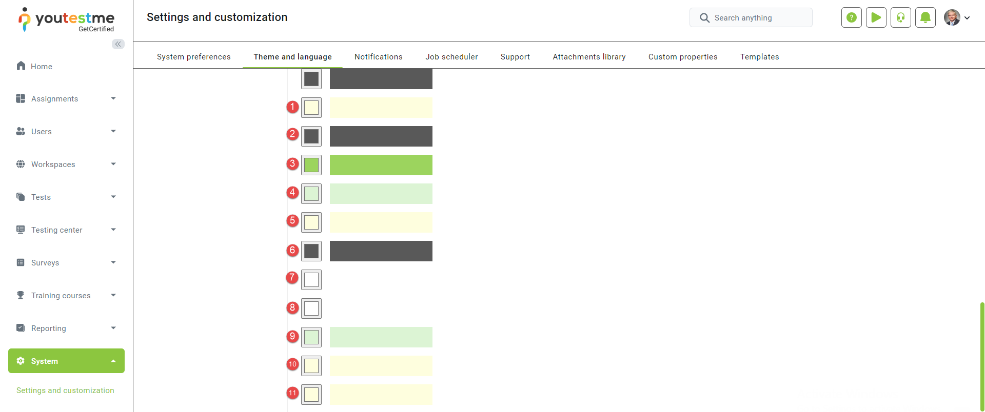
Below is an example where specific color changes can be observed.
- Change Finish test button color.
- Change answered questions color.
- Change the unanswered questions’ color.
- Change the correct answer color.
- Change the incorrect answer color.
- Change the finish quiz text color.
- Change the unanswered question text color.
- Change the unanswered question text color.
- Change the feedback text box for correct answers color. Please note that this color will also apply to both the answer and question feedback text boxes.
- Change the feedback text box for incorrect answers color. Please note that this color will also apply to both the answer and question feedback text boxes.
- Change the color of the selected answer within the test-taking process.
In test:
Additionally, another way to change the color is by choosing between RGB, HSL, or HEX formats and selecting their respective option names.
White labeling #
On this tab, you can customize the text of the login page, privacy policy display, links, system naming, and more.
The following options are available:
- Web browser’s tab title – Modify the application name in the web browsers tab title, right beside the favicon.
- Confirmation label – Modify the acknowledgment text presented on the instructions screen before the test begins. Additionally, this text can be customized for each test separately under the Test instructions dialog settings. To include an acknowledgment checkbox for candidates, make sure to enable the Require instructions acknowledgment option.
Note: Changing the application language will result in the translation of the default text. However, modifying the default text itself will not be translated when altering the application language. - Emails sent from – The name entered here will be presented as the sender’s name in the email body, replacing the $from$ parameter.
- Application link – The URL entered here will be used to generate necessary links for email notifications. The YouTestMe team will update this link if you have configured a custom application domain. This ensures that the email links will be presented using the new custom domain.
- Login instructions – Provide detailed guidelines or include useful links for users to be displayed on the login screen.
- Display privacy policy – Enable this option and a privacy policy link will be displayed on the user registration page.
- Privacy policy link – Enter your custom privacy policy link instead of the default one.
- Display personal report animation – Show/Hide animation on the left side of the candidate’s personal report page

Logo and favicon #
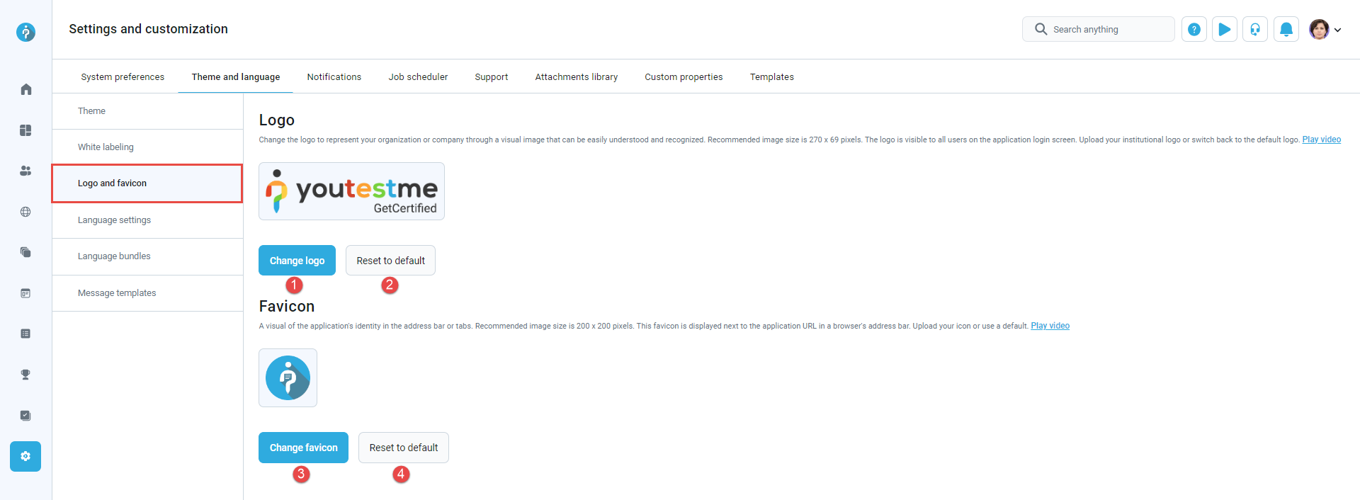
On this tab, you can change the logo and favicon of the application.
- Click the Change logo button to upload a logo representing your company or organization. The recommended image size is 270 x 69 pixels.
- Click Reset to default to restore the application logo to the default one.
- Click the Change favicon button to replace the favicon displayed in the web browser’s tab title.
- Click Reset to default to restore the favicon to its default setting.
For more information, please watch this video.


